The Content Architecture
scanned Nov 19, 2026, 00:12
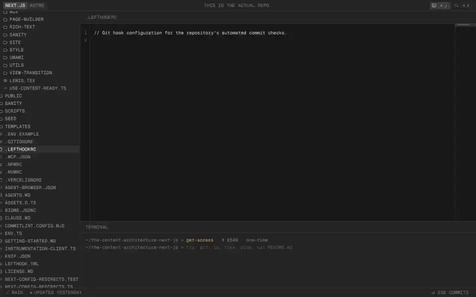
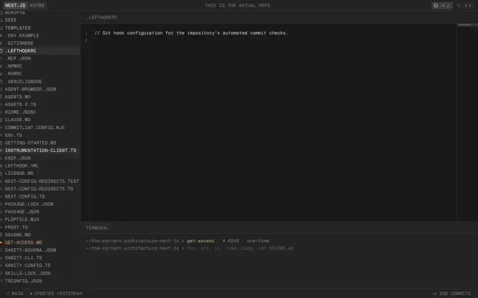
Typography
“NEXT.JS”
Text of the largest headline, set in our own typeface here.
- Headline
- Geist Mono · Mono · Google Fonts
- Metrics
- 14 px · weight 400 · Tracking 0.025 em · all caps
- Alignment
- centered
- Body text
- Geist · 15.7388px
Color
#181818
53 %
53 %
#242424
34 %
34 %
#313131
6 %
6 %
#232423
5 %
5 %
#202020
1 %
1 %
#161616
1 %
1 %
Background Dark · accent No accent
Structure
- Hero
- Canvas / WebGL
- Buttons
- no button surface detected
- Icons
- Custom SVGs
- Motion
- Lenis
- Platform
- Next.js
Designer or template?
Designer signals · 6.0
- Display/body font pairing+1
- Canvas/WebGL hero+2
- Mask / clip-path reveals+1
- Choreographed scroll animation (Lenis)+1.5
- All-caps headline+0.5
AI / template signals · 3.0
- Default font as headline (Geist Mono)+2 Inter, Roboto, Fraunces, Geist, Plus Jakarta Sans, and Space Grotesk are used on so many sites they no longer feel distinctive. Each new wave of AI-generated UIs converges on the same handful of faces. Choose a face that gives your interface personality. overused-font ↗
- Flat type hierarchy (headline 13px, body 15.7388px)+1 Dominant heading and body roles are separated by less than 1.25× at every step, leaving the size hierarchy flat. Add at least one stronger size step. flat-type-hierarchy ↗
A heuristic based on visible features. It measures closeness to template defaults, not quality. Many rules come from the impeccable.style catalog; a finding is a reason to look closer, not a verdict.
All markers
Background
Dark
Color
No accent
Font source
Google Fonts
Hero
Canvas / WebGL
Icons
Custom SVGs
Layout
Centered
Motion
Lenis
Platform
Next.js
Type
Mono headline
Typography
All capsMono accents
Verdict
Designer craft
Similar sites
Sharing the most markers

Sommerseth Design
Geist · 104px · sommersethdesign.no
Designer craft
Canvas / WebGL

Carterogunsola
Oracle · 38px · carterogunsola.com
Designer craft
Canvas / WebGL

Sagar K. Ghosh
space Grotesk · 71px · codeofsagar.in
Mixed
Canvas / WebGL
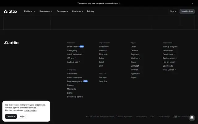
Attio
inter Display · 56px · attio.com
Designer craft
Canvas / WebGL

Giga
Inter · 16px · giga.ai
Mixed
Canvas / WebGL
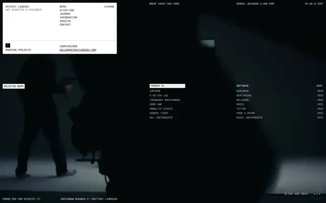
Artemiilebedev
Fragment Mono · 11px · artemiilebedev.com
Designer craft
Video
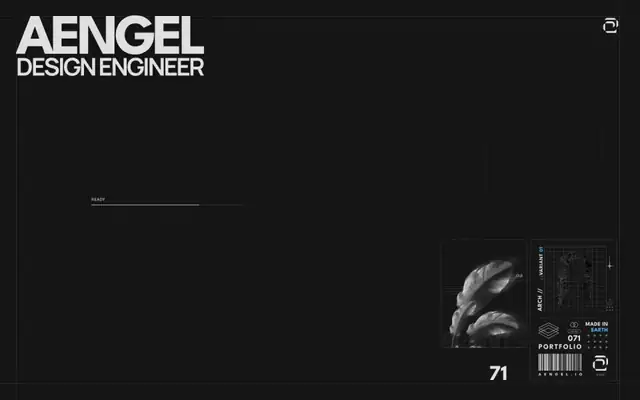
aengel.io
League Spartan · 129px · aengel.io
Designer craft
Canvas / WebGL

Customer Context Layer
Inter · 160px · dovetailapp.com
Mixed
Canvas / WebGL