FUTURE HUMAN
scanned Nov 19, 2026, 00:12
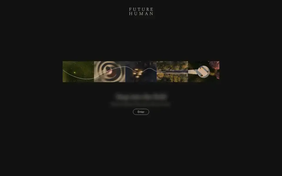
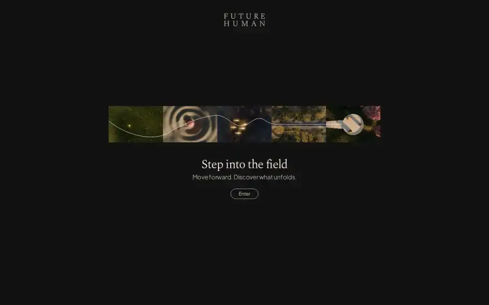
Typography
“Go Deeper”
Text of the largest headline, set in our own typeface here.
- Headline
- Plus Jakarta Sans · Sans · Google Fonts
- Metrics
- 14 px · weight 300 · Tracking -0.02 em
- Alignment
- left-aligned
- Body text
- Plus Jakarta Sans · 18px
Color
#111111
89 %
89 %
#191915
5 %
5 %
#4e4635
3 %
3 %
#131113
1 %
1 %
#12110e
1 %
1 %
#0f110d
0 %
0 %
Background Dark · accent No accent
Structure
- Hero
- Video
- Buttons
- no button surface detected
- Icons
- Custom SVGs
- Motion
- Framer Motion
- Platform
- Framer
Designer or template?
Designer signals · 0.5
- Asymmetric hero+0.5
AI / template signals · 3.5
- Default font as headline (Plus Jakarta Sans)+2 Inter, Roboto, Fraunces, Geist, Plus Jakarta Sans, and Space Grotesk are used on so many sites they no longer feel distinctive. Each new wave of AI-generated UIs converges on the same handful of faces. Choose a face that gives your interface personality. overused-font ↗
- Lots of glass / backdrop blur+0.5
- Flat type hierarchy (headline 14px, body 18px)+1 Dominant heading and body roles are separated by less than 1.25× at every step, leaving the size hierarchy flat. Add at least one stronger size step. flat-type-hierarchy ↗
A heuristic based on visible features. It measures closeness to template defaults, not quality. Many rules come from the impeccable.style catalog; a finding is a reason to look closer, not a verdict.
All markers
Background
Dark
Color
No accent
Effect
Glass / blur
Font source
Google Fonts
Hero
Video
Icons
Custom SVGs
Layout
Left-aligned
Motion
Framer Motion
Platform
Framer
Type
Sans headline
Typography
One family
Verdict
AI / template look
Similar sites
Sharing the most markers
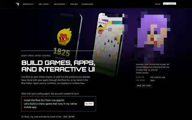
Rive
Orbitron · 48px · rive.app
Designer craft
Video
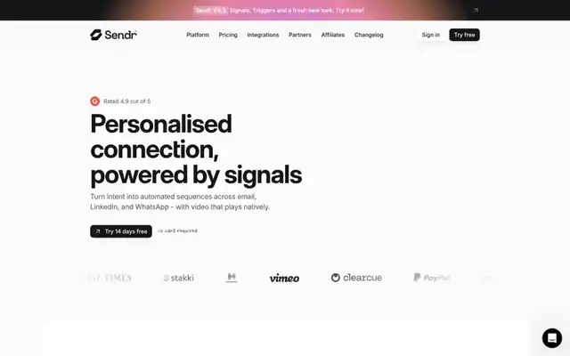
Sendr.ai
Inter Display · 64px · sendr.ai
AI / template look
Video

Twelvelabs
Milling Duplex 1mm · 56px · twelvelabs.io
Designer craft
Canvas / WebGL
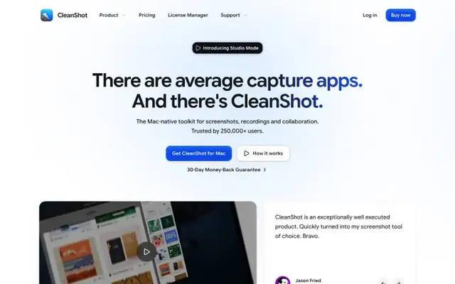
CleanShot X for Mac
Google Sans Flex · 60px · go.cleanshot.com
AI / template look
Video
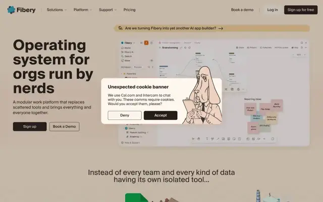
Fibery
Suisse Intl · 64px · fibery.io
Designer craft
Video

Stivio
Geist · 64px · stivio.ai
AI / template look
Video

Bonsplit
Arial · 18px · bonsplit.alasdairmonk.com
AI / template look
Video
praised

pwn.watch
IBM Plex Sans · 32px · pwn.watch
Mixed
Text + UI / illustration
praised