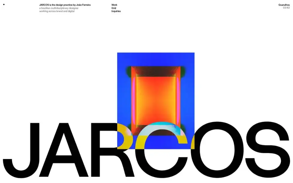
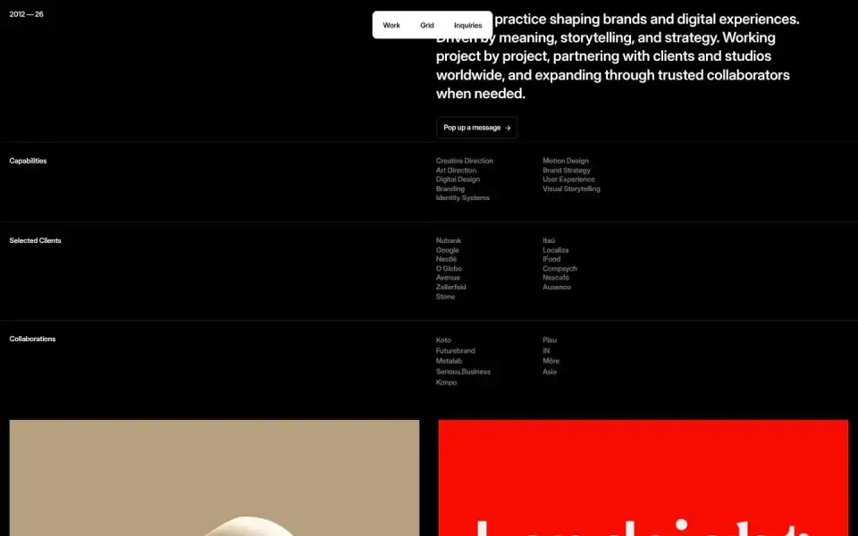
Typography
“Work”
Text of the largest headline, set in our own typeface here.
- Headline
- Inter Display · Sans · Custom / licensed
- Metrics
- 12 px · weight 600 · Tracking 0.0 em
- Alignment
- centered
- Body text
- sans-serif · 12px
Color
#ffffff
71 %
71 %
#010101
9 %
9 %
#3e329d
6 %
6 %
#dacaa2
6 %
6 %
#7e5a97
3 %
3 %
#080a22
2 %
2 %
Background Light · accent Indigo #3e329d
Structure
- Hero
- Large image / photo
- Buttons
- Rounded · Outline · with icon
InquiriesPop up a message
- Icons
- Few icons
- Motion
- Lenis, Framer Motion
- Platform
- Framer
Designer or template?
Designer signals · 7.0
- Custom / licensed font (Inter Display)+2.5
- Display/body font pairing+1
- Blend modes+1
- Mask / clip-path reveals+1
- Choreographed scroll animation (Lenis)+1.5
AI / template signals · 3.0
- Default font as headline (Inter Display)+2 Inter, Roboto, Fraunces, Geist, Plus Jakarta Sans, and Space Grotesk are used on so many sites they no longer feel distinctive. Each new wave of AI-generated UIs converges on the same handful of faces. Choose a face that gives your interface personality. overused-font ↗
- Flat type hierarchy (headline 12px, body 12px)+1 Dominant heading and body roles are separated by less than 1.25× at every step, leaving the size hierarchy flat. Add at least one stronger size step. flat-type-hierarchy ↗
A heuristic based on visible features. It measures closeness to template defaults, not quality. Many rules come from the impeccable.style catalog; a finding is a reason to look closer, not a verdict.
All markers
Background
Light
Buttons
RoundedWith arrow / icon
Color
Indigo
Effect
Blend modesMask reveals
Font source
Custom / licensed
Hero
Large image / photo
Icons
Few icons
Layout
Centered
Motion
Framer MotionLenis
Platform
Framer
Type
Sans headline
Verdict
Designer craft
Similar sites
Sharing the most markers
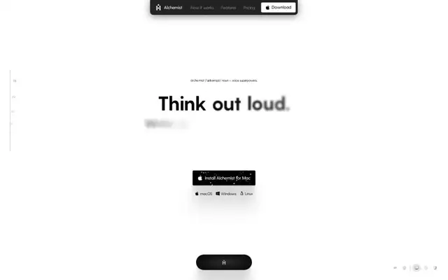
Getalchemist
Greycliff · 14px · getalchemist.app
Designer craft
Text + UI / illustration

Family
Family · 68px · family.co
Designer craft
Text + UI / illustration

Frame of Preference
Pixel Font22 · 88px · aresluna.org
Designer craft
Text + UI / illustration
praised
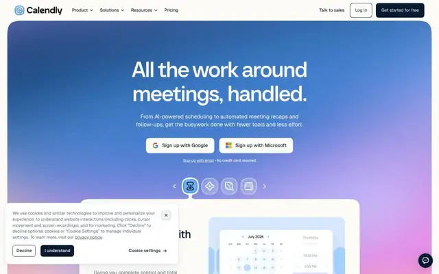
Calendly
Calendly Sans · 72px · calendly.com
Designer craft
Canvas / WebGL
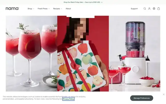
Nama
TT Rationalist · 60px · namawell.com
Designer craft
Large image / photo
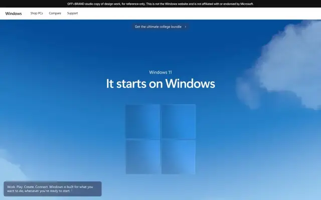
Windows (OFF+BRAND studio copy)
Segoe Sans · 56px · windows.itsoffbrand.com
Designer craft
Canvas / WebGL
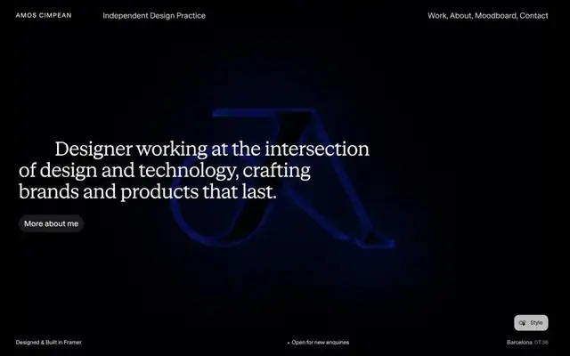
Amos Cimpean
STK Bureau Serif · 50px · amoscimpean.com
Designer craft
Canvas / WebGL
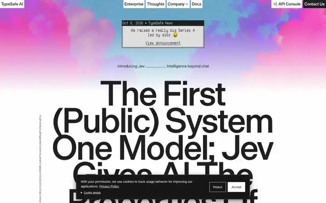
TypeSafe AI
Die Grotesk C · 150px · typesafe.ai
Designer craft
Typographic (XXL)