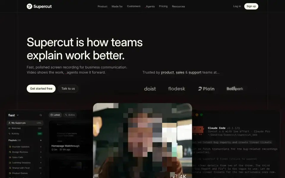
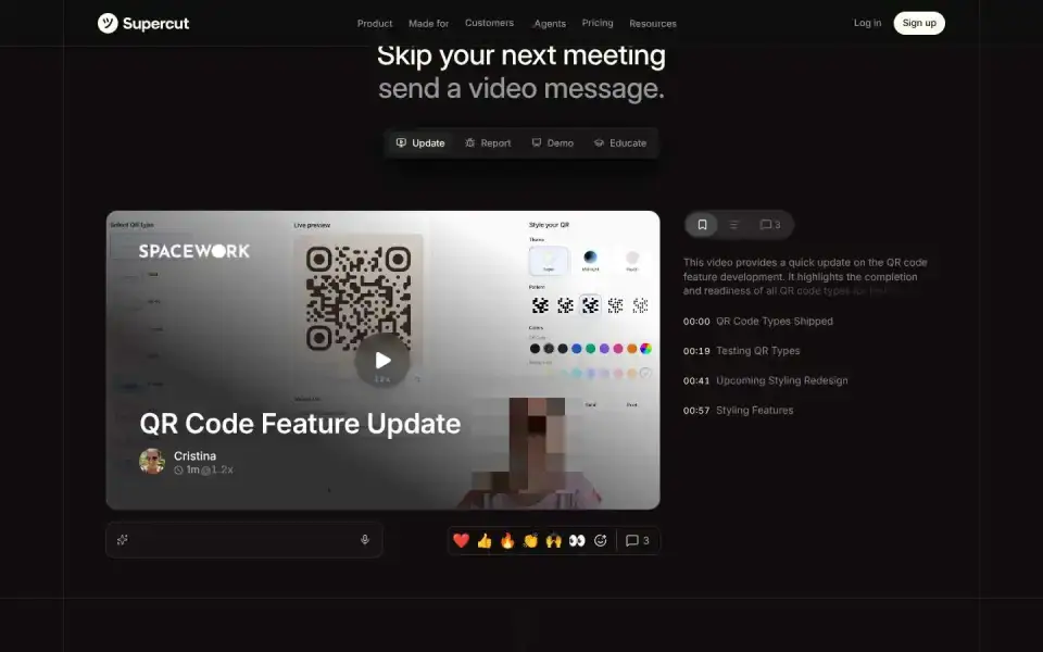
Typography
“Supercut”
Text of the largest headline, set in our own typeface here.
- Headline
- Inter Display · Sans · Custom / licensed
- Metrics
- 60 px · weight 500 · Tracking -0.018 em
- Alignment
- left-aligned
- Body text
- Inter · 18px
Color
#120f10
32 %
32 %
#0e0f0e
15 %
15 %
#45423e
14 %
14 %
#100d0d
11 %
11 %
#090909
10 %
10 %
#160f0f
8 %
8 %
Background Dark · accent No accent
Structure
- Hero
- Video
- Buttons
- Rounded · Filled
Sign upGet started freeTalk to us
- Icons
- Lucide
- Motion
- no library detected
- Platform
- Not detected
Designer or template?
Designer signals · 5.0
- Custom / licensed font (Inter Display)+2.5
- Display/body font pairing+1
- Mask / clip-path reveals+1
- Asymmetric hero+0.5
AI / template signals · 5.0
- Default font as headline (Inter Display)+2 Inter, Roboto, Fraunces, Geist, Plus Jakarta Sans, and Space Grotesk are used on so many sites they no longer feel distinctive. Each new wave of AI-generated UIs converges on the same handful of faces. Choose a face that gives your interface personality. overused-font ↗
- Three icon cards in a row+1.5 A small rounded-square icon container above a heading is the universal AI feature-card template — every generator outputs this exact shape. Try a side-by-side icon and heading, or let the icon sit in flow without its own container. icon-tile-stack ↗
- Lucide icons+1.5
A heuristic based on visible features. It measures closeness to template defaults, not quality. Many rules come from the impeccable.style catalog; a finding is a reason to look closer, not a verdict.
All markers
Background
Dark
Buttons
Rounded
Color
No accent
Font source
Custom / licensed
Hero
Video
Icons
Lucide
Layout
Left-aligned
Platform
Not detected
Type
Sans headline
Verdict
Mixed
Similar sites
Sharing the most markers
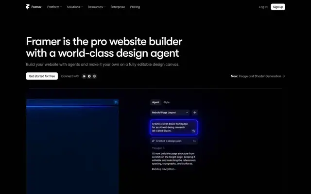
Framer
GT Walsheim · 54px · framer.com
Mixed
Video
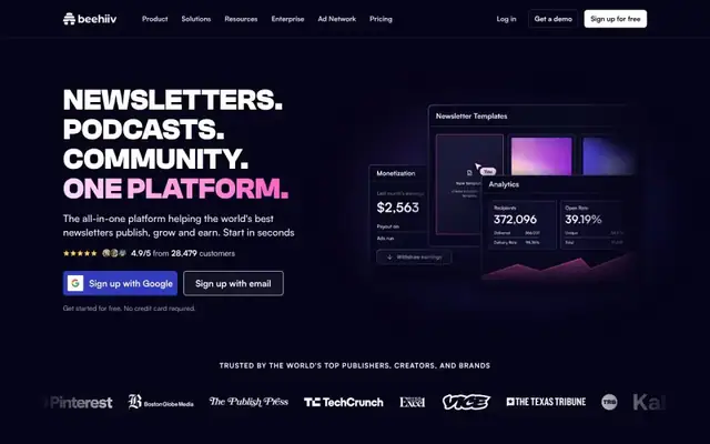
beehiiv
Clash Grotesk · 60px · beehiiv.com
Mixed
Large image / photo
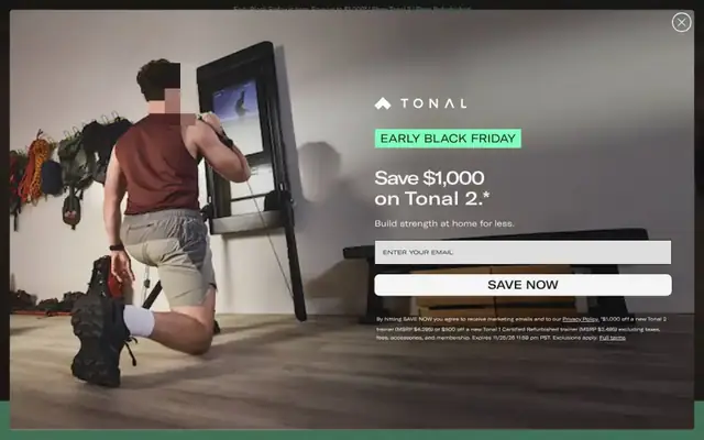
Tonal
GT Extended · 80px · tonal.com
Designer craft
Video

Twelvelabs
Milling Duplex 1mm · 56px · twelvelabs.io
Designer craft
Canvas / WebGL
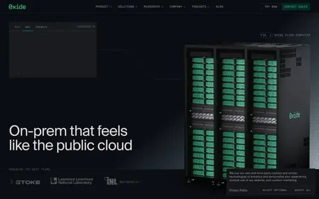
Oxide
Suisse Intl · 65px · oxide.computer
Mixed
Large image / photo

Onlook
SF Pro · 32px · onlook.cam
Mixed
Canvas / WebGL
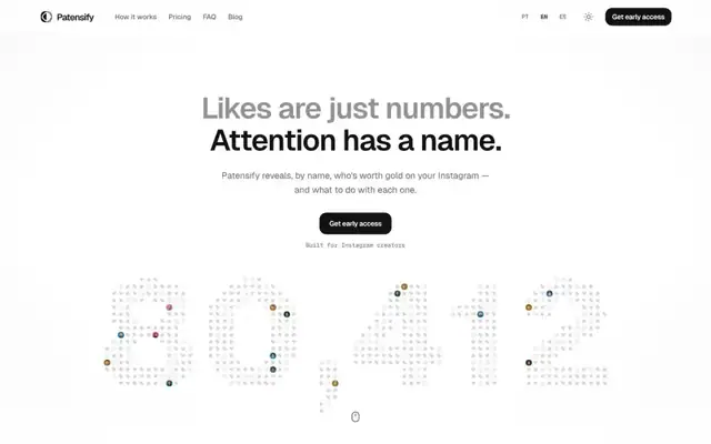
Patensify
Geist · 60px · patensify.com
Mixed
Canvas / WebGL
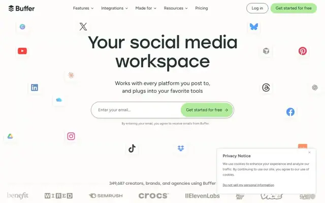
Buffer
Stolzl · 76px · buffer.com
Mixed
Text + UI / illustration