про стратегический маркетинг
scanned Nov 19, 2026, 00:12


Typography
“Маркетинг для девелоперских компаний.”
Text of the largest headline, set in our own typeface here.
Color
#ffffff
81 %
81 %
#f7f7f5
6 %
6 %
#6f6e6e
3 %
3 %
#fefefe
3 %
3 %
#ededec
3 %
3 %
#fbfbfb
2 %
2 %
Background Light · accent No accent
Structure
- Hero
- Video
- Buttons
- Rounded · Filled
Связаться
- Icons
- Lucide
- Motion
- no library detected
- Platform
- Not detected
Designer or template?
Designer signals · 0.0
- none
AI / template signals · 5.0
- Default font as headline (Inter)+2 Inter, Roboto, Fraunces, Geist, Plus Jakarta Sans, and Space Grotesk are used on so many sites they no longer feel distinctive. Each new wave of AI-generated UIs converges on the same handful of faces. Choose a face that gives your interface personality. overused-font ↗
- Three icon cards in a row+1.5 A small rounded-square icon container above a heading is the universal AI feature-card template — every generator outputs this exact shape. Try a side-by-side icon and heading, or let the icon sit in flow without its own container. icon-tile-stack ↗
- Lucide icons+1.5
A heuristic based on visible features. It measures closeness to template defaults, not quality. Many rules come from the impeccable.style catalog; a finding is a reason to look closer, not a verdict.
All markers
Background
Light
Buttons
Rounded
Color
No accent
Effect
Three icon cards
Font source
Google Fonts
Hero
Video
Icons
Lucide
Layout
Centered
Platform
Not detected
Type
Sans headline
Typography
One familyTight tracking
Verdict
AI / template look
Similar sites
Sharing the most markers
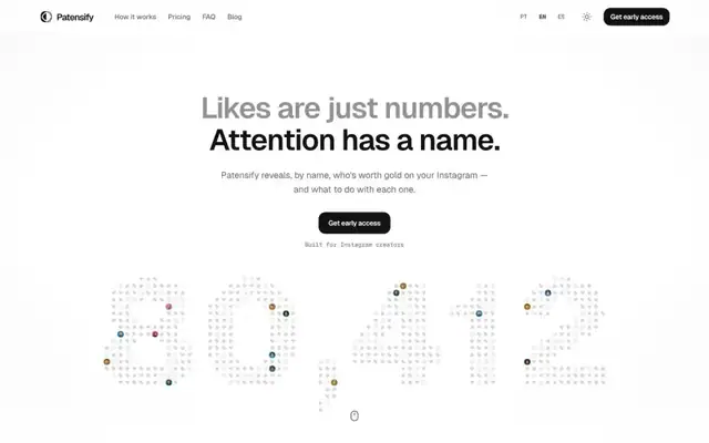
Patensify
Geist · 60px · patensify.com
Mixed
Canvas / WebGL
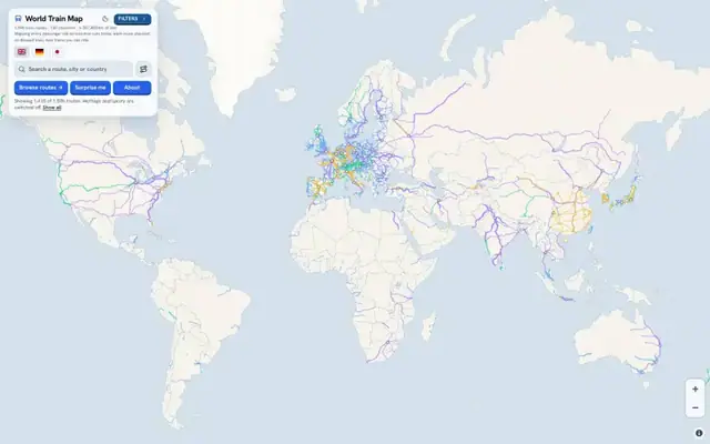
World Train Map
Hanken Grotesk · 16px · worldtrainmap.com
Mixed
Canvas / WebGL
praised
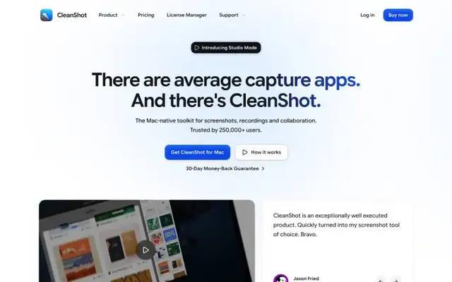
CleanShot X for Mac
Google Sans Flex · 60px · go.cleanshot.com
AI / template look
Video
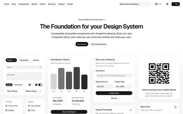
shadcn/ui
Geist · 48px · ui.shadcn.com
AI / template look
Text + UI / illustration

Stivio
Geist · 64px · stivio.ai
AI / template look
Video
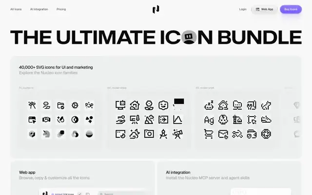
40,000+ SVG Icons
Geist · 19px · nucleoapp.com
AI / template look
Large image / photo

Nelty
Manrope · 84px · nelty.co
AI / template look
Text + UI / illustration
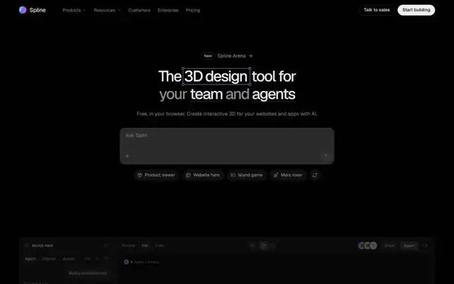
Spline
Geist · 48px · spline.design
AI / template look
Canvas / WebGL