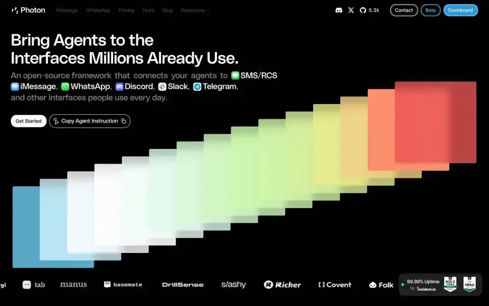
Typography
“Bring Agents to the”
Text of the largest headline, set in our own typeface here.
- Headline
- PolySans Arabic VF Variable Slim · Sans · Custom / licensed
- Metrics
- 48 px · weight 300 · Tracking -0.01 em
- Alignment
- left-aligned
- Body text
- PolySans Arabic VF Variable Slim · 24px
Color
#010101
50 %
50 %
#d7e9c5
26 %
26 %
#604543
9 %
9 %
#030101
8 %
8 %
#010000
4 %
4 %
#010103
1 %
1 %
Background Dark · accent Lime #d7e9c5
Structure
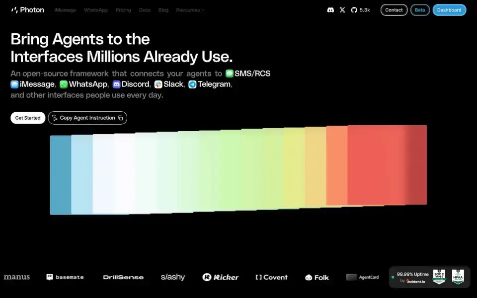
- Hero
- Canvas / WebGL
- Buttons
- Pill · Filled · with icon
ContactBetaDashboard
- Icons
- Custom SVGs
- Motion
- no library detected
- Platform
- Framer
Designer or template?
Designer signals · 7.0
- Custom / licensed font (PolySans Arabic VF Variable Slim)+2.5
- Canvas/WebGL hero+2
- Blend modes+1
- Mask / clip-path reveals+1
- Asymmetric hero+0.5
AI / template signals · 4.5
- Pill badge above the headline+1.5 A tiny uppercase letter-spaced label sitting immediately above an oversized hero headline — or the same shape rendered as a pill chip — is now the default AI SaaS hero. Drop the eyebrow, integrate the kicker into the headline, or run it as a navigation breadcrumb instead. hero-eyebrow-chip ↗
- Three icon cards in a row+1.5 A small rounded-square icon container above a heading is the universal AI feature-card template — every generator outputs this exact shape. Try a side-by-side icon and heading, or let the icon sit in flow without its own container. icon-tile-stack ↗
- Near-black + neon green+1
- Lots of glass / backdrop blur+0.5
A heuristic based on visible features. It measures closeness to template defaults, not quality. Many rules come from the impeccable.style catalog; a finding is a reason to look closer, not a verdict.
All markers
Background
Dark
Buttons
PillWith arrow / icon
Color
Lime
Font source
Custom / licensed
Hero
Canvas / WebGL
Icons
Custom SVGs
Layout
Left-aligned
Platform
Framer
Type
Sans headline
Typography
Mono accentsOne family
Verdict
Mixed
Similar sites
Sharing the most markers

Nooks
Aeonikpro · 60px · nooks.ai
Designer craft
Canvas / WebGL
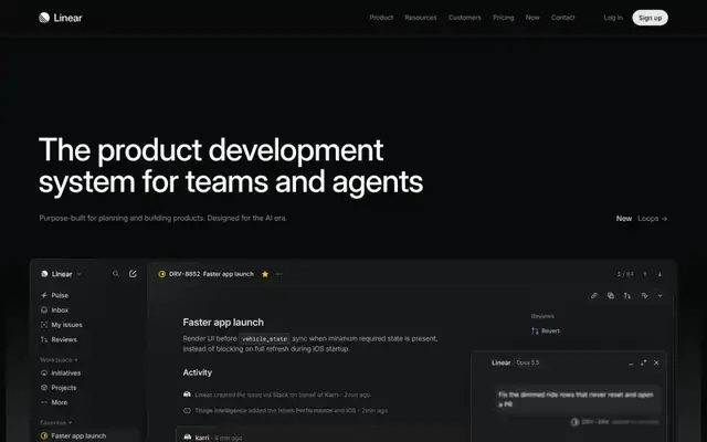
Linear
Inter · 64px · linear.app
Mixed
Large image / photo

Giga
Inter · 16px · giga.ai
Mixed
Canvas / WebGL
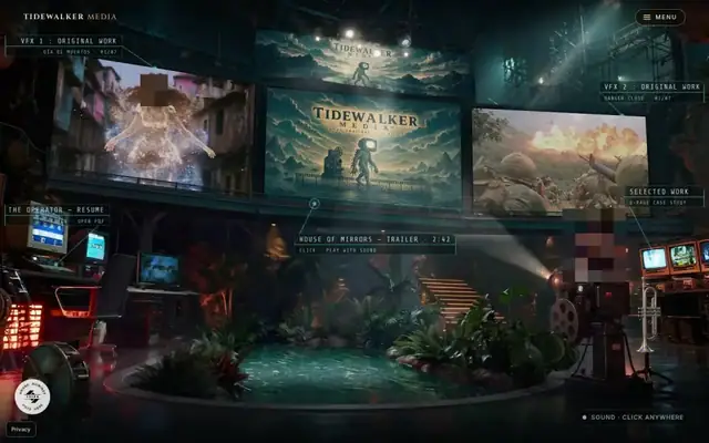
Tidewalker Media
Inter · 32px · tidewalkermedia.com
Mixed
Canvas / WebGL

Twelvelabs
Milling Duplex 1mm · 56px · twelvelabs.io
Designer craft
Canvas / WebGL
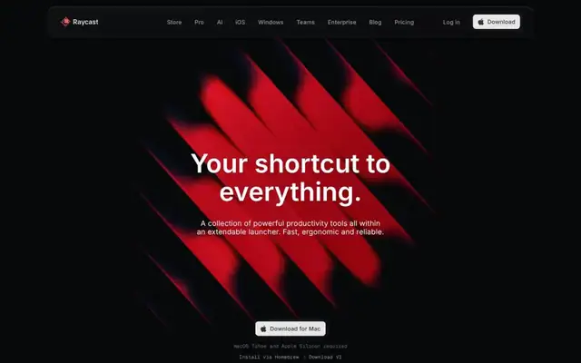
Raycast
Inter · 64px · raycast.com
Mixed
Canvas / WebGL
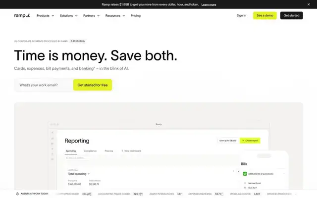
Ramp
Lausanne · 64px · ramp.com
Designer craft
Canvas / WebGL
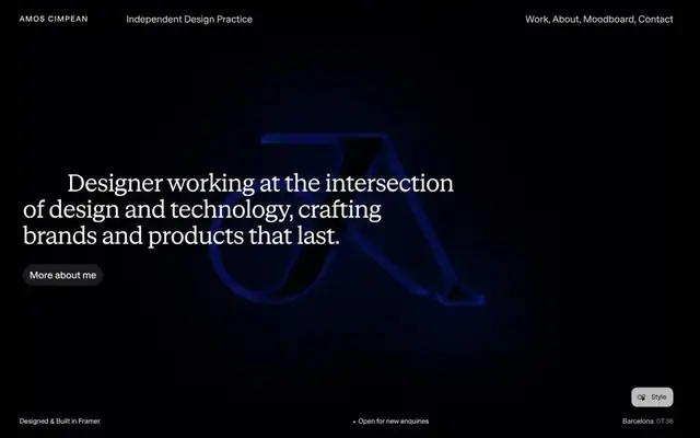
Amos Cimpean
STK Bureau Serif · 50px · amoscimpean.com
Designer craft
Canvas / WebGL