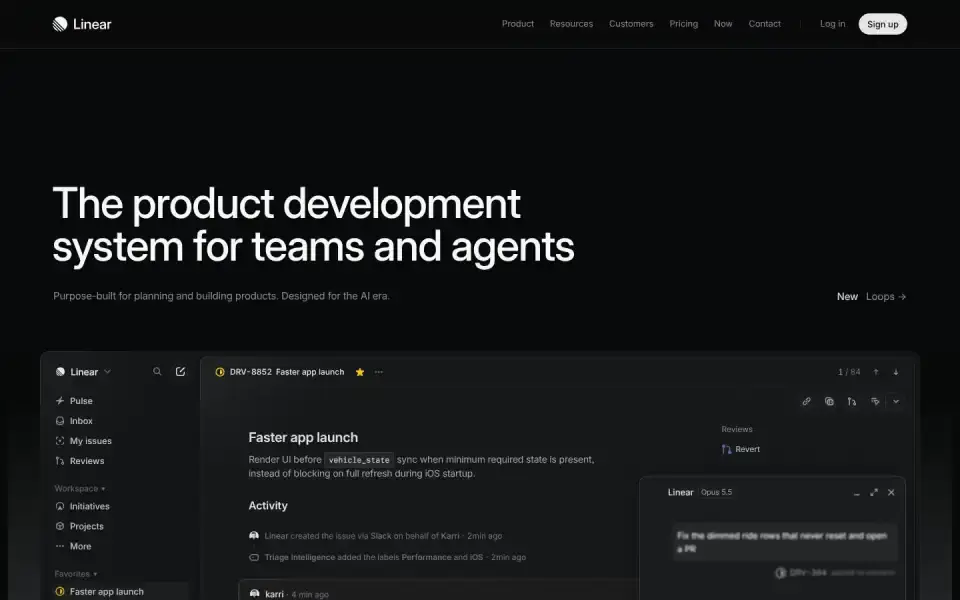
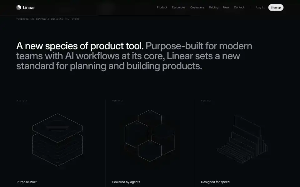
Typography
“The product development”
Text of the largest headline, set in our own typeface here.
Color
#080a0b
41 %
41 %
#111214
35 %
35 %
#292b2c
10 %
10 %
#080a09
7 %
7 %
#0a0a0c
4 %
4 %
#070808
3 %
3 %
Background Dark · accent No accent
Structure
- Hero
- Large image / photo
- Buttons
- Pill · Outline · with icon
Sign upFaster app launchPerformance
- Icons
- Custom SVGs
- Motion
- no library detected
- Platform
- Next.js
Designer or template?
Designer signals · 2.5
- Blend modes+1
- Mask / clip-path reveals+1
- Asymmetric hero+0.5
AI / template signals · 2.0
- Default font as headline (Inter)+2 Inter, Roboto, Fraunces, Geist, Plus Jakarta Sans, and Space Grotesk are used on so many sites they no longer feel distinctive. Each new wave of AI-generated UIs converges on the same handful of faces. Choose a face that gives your interface personality. overused-font ↗
A heuristic based on visible features. It measures closeness to template defaults, not quality. Many rules come from the impeccable.style catalog; a finding is a reason to look closer, not a verdict.
All markers
Background
Dark
Buttons
PillWith arrow / icon
Color
No accent
Font source
Google Fonts
Hero
Large image / photo
Icons
Custom SVGs
Layout
Left-aligned
Platform
Next.js
Type
Sans headline
Typography
Mono accentsOne family
Verdict
Mixed
Similar sites
Sharing the most markers

Giga
Inter · 16px · giga.ai
Mixed
Canvas / WebGL
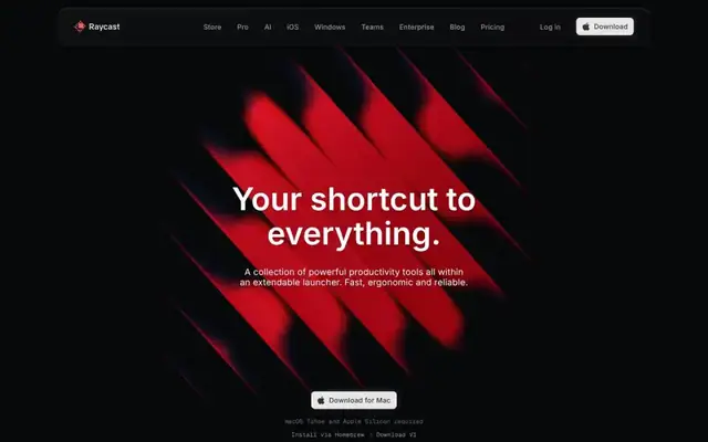
Raycast
Inter · 64px · raycast.com
Mixed
Canvas / WebGL
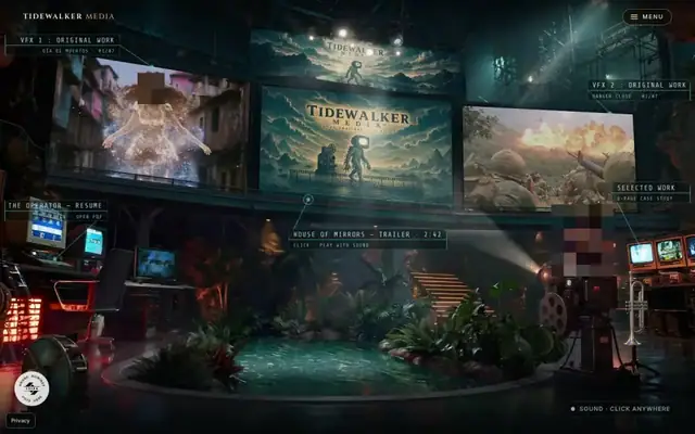
Tidewalker Media
Inter · 32px · tidewalkermedia.com
Mixed
Canvas / WebGL
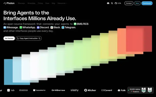
Photon
PolySans Arabic VF Variable Slim · 48px · photon.codes
Mixed
Canvas / WebGL
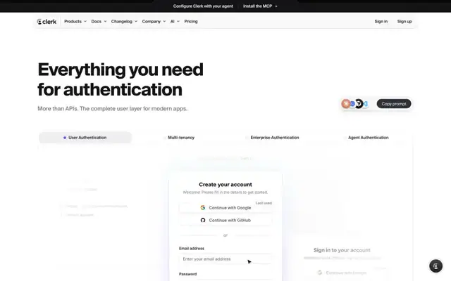
Clerk
geist Numbers · 56px · clerk.com
Designer craft
Canvas / WebGL
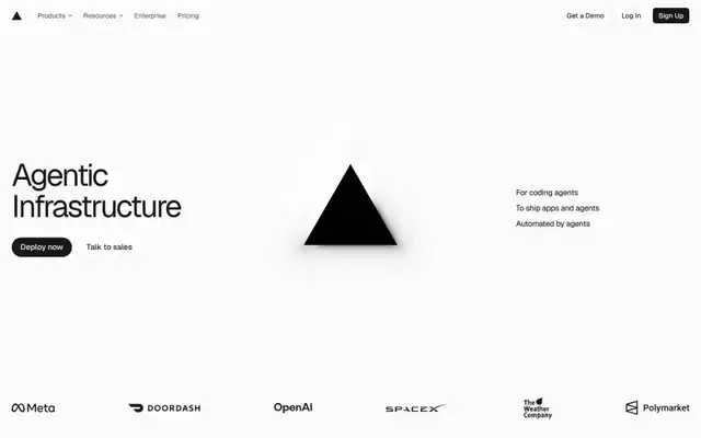
Vercel
Geist · 64px · vercel.com
Mixed
Canvas / WebGL
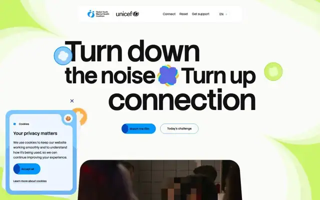
Turn Down the Noise
stack Sans Headline · 130px · turndownthenoise.global
Mixed
Typographic (XXL)
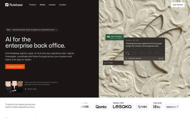
Rulebase
Momo Trust Sans · 46px · rulebase.co
Mixed
Text + UI / illustration