Turn Down the Noise
scanned Nov 19, 2026, 00:11
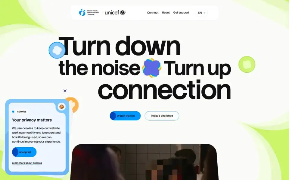
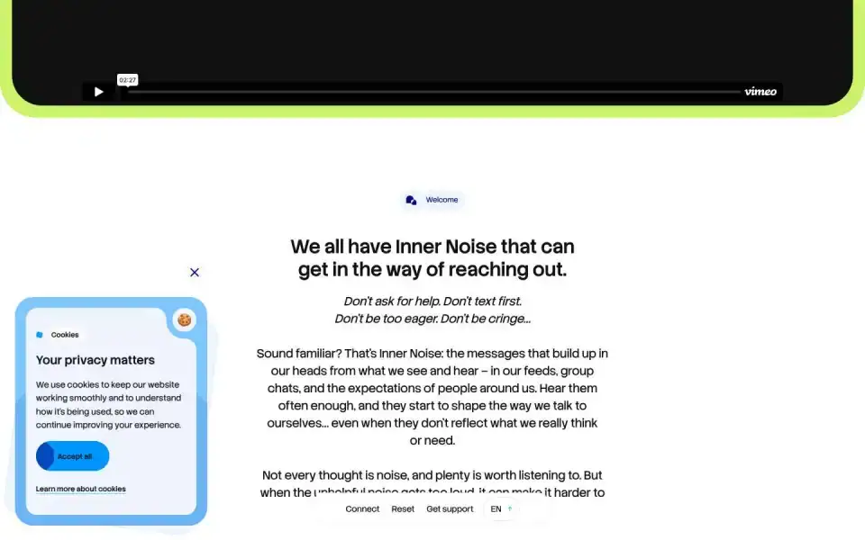
Typography
“Turn”
Text of the largest headline, set in our own typeface here.
- Headline
- stack Sans Headline · Sans · Google Fonts
- Metrics
- 130 px · weight 600 · Tracking -0.03 em
- Alignment
- left-aligned
- Body text
- stack Sans Headline · 20px
Color
#fafbf8
48 %
48 %
#35393f
18 %
18 %
#ddefd4
13 %
13 %
#f7fcfa
6 %
6 %
#fefefd
6 %
6 %
#f5fce7
5 %
5 %
Background Light · accent No accent
Structure
- Hero
- Typographic (XXL)
- Buttons
- Pill · Filled · with icon
ENENToday's challenge Today'
- Icons
- Custom SVGs
- Motion
- Lenis
- Platform
- Next.js
Designer or template?
Designer signals · 4.5
- Custom cursor+1.5
- Mask / clip-path reveals+1
- Choreographed scroll animation (Lenis)+1.5
- Asymmetric hero+0.5
AI / template signals · 5.0
- Purple/indigo gradient+3 Purple/violet gradients and cyan-on-dark are the most recognizable tells of AI-generated UIs. A gradient in one of those hues is the tell on its own; flat neon ink on a dark ground is charged once a second tell hue joins it. Choose a distinctive, intentional palette. ai-color-palette ↗
- Gradient text+2 Gradient text is decorative rather than meaningful — a common AI tell, especially on headings and metrics. Use solid colors for text. gradient-text ↗
A heuristic based on visible features. It measures closeness to template defaults, not quality. Many rules come from the impeccable.style catalog; a finding is a reason to look closer, not a verdict.
All markers
Background
Light
Buttons
PillWith arrow / icon
Color
No accent
Font source
Google Fonts
Hero
Typographic (XXL)
Icons
Custom SVGs
Layout
Left-aligned
Motion
Lenis
Platform
Next.js
Type
Sans headline
Typography
One familyXXL headline
Verdict
Mixed
Similar sites
Sharing the most markers
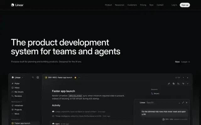
Linear
Inter · 64px · linear.app
Mixed
Large image / photo
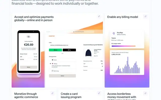
Stripe
Söhne · 32px · stripe.com
Mixed
Canvas / WebGL

Giga
Inter · 16px · giga.ai
Mixed
Canvas / WebGL

Sommerseth Design
Geist · 104px · sommersethdesign.no
Designer craft
Canvas / WebGL
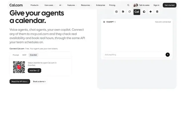
Cal.com
cal Sans · 56px · cal.com
AI / template look
Canvas / WebGL
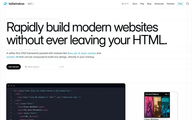
Tailwind CSS
Inter · 96px · tailwindcss.com
AI / template look
Typographic (XXL)
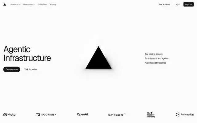
Vercel
Geist · 64px · vercel.com
Mixed
Canvas / WebGL
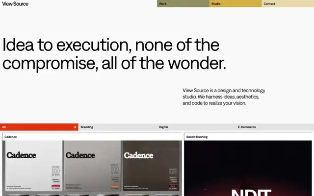
View Source
font Denim INK · 84px · view-source.com
Designer craft
Large image / photo